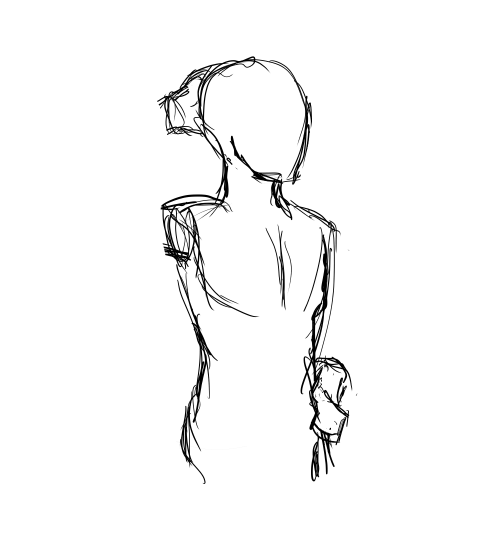
skin color ref because some of yall non-black poc and whites keep fucking up as if yall don’t know there’s other shades of brown when u racebend for woke points or something
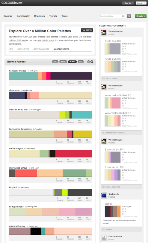
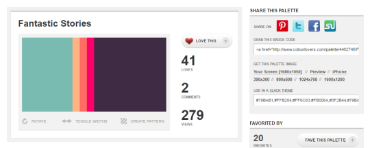
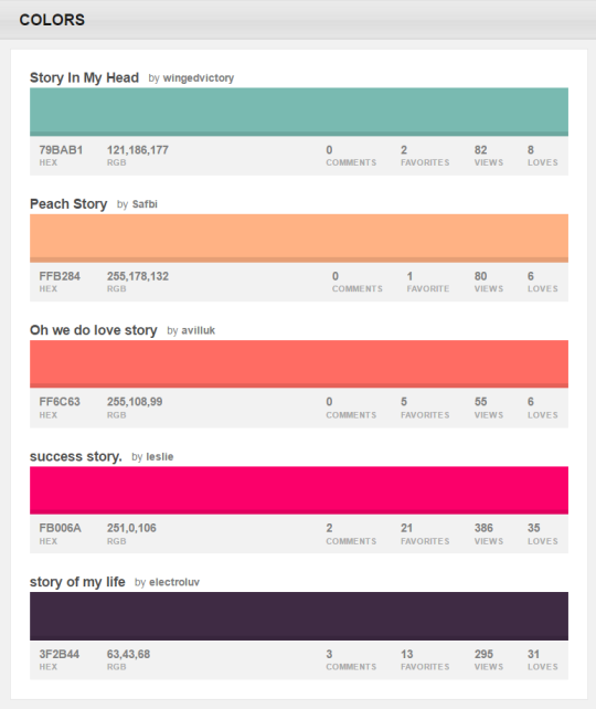
You can browse the most popular ones or search for certain colors, themes, and even specific hex codes!
When you find one you like, you can download a wallpaper swatch of it and also select the specific colors it uses to look at more palettes that use those same ones.
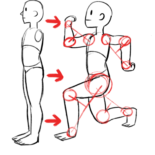
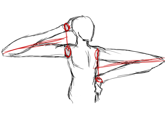
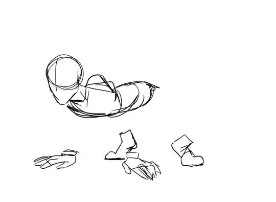
my advice: have fun and play–play is learning | always be watching real life to see how things move | also be watching cool animations to learn from them | it’s hard but so worth it when things turn out well, good luck!
Disney’s Comic Strip Artist’s Kit by Carson van Osten.
You might know these already, but it is such good stuff I don’t think anybody minds if I share it here again. These hand-outs were meant as a way to get beginning artists working on the Disney comics to overcome some recurring drawing problems.
I found this on Mark Kennedy’s awesome blog: Temple of the Seven Golden Camels. Hence the ‘To Mark’ dedication on the fist page which, I guess, features some pretty sound advice for any artist:
“Just keep drawing my friend… Draw like the wind!”
1) the flat colours are NOT bucket filled because my line art is lazy. Don’t be fooled. It’s lazy.
2) don’t forget about composition!!!!!! It’s important!!
3) the overlay layer goes underneath the lumi&shade and lumi layers. Blue’s original colours were very cold. By adding a warm-toned overlay layer, I was able to “warm up” her colour palette as well as darken the overall piece for a the more intimate effect I was going for. As below:
5) the last effect is a noise layer that apply through GIMP rather than SAI. The noise layer darkens the piece just a tad bit more, as well as gives the picture a grainy and “cinematic” finish which I like in these kinds of pieces. I don’t use a noise layer all the time, but for something with dramatic lighting and closeness like this, I love using noise layers to add a finishing touch.
Don’t be afraid to experiment with different techniques! These are just basic ones that I use!